Priory Kitchen was the first client I had the opportunity to collaborate with to create a distinctive and easily recognizable brand identity. My goal was to design a simple yet modern logo that could be effectively used across various platforms and materials. The outcome of the project exceeded expectations, resulting in a cohesive brand presence.
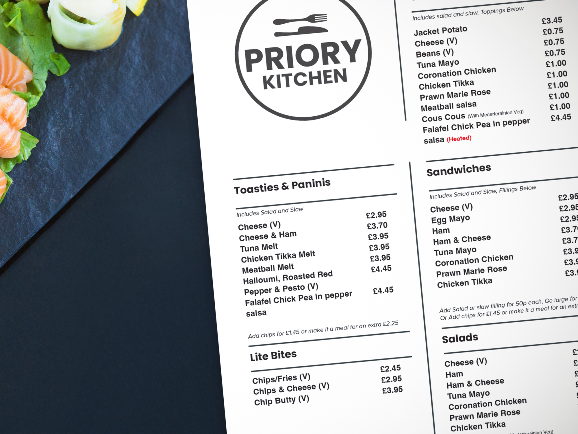
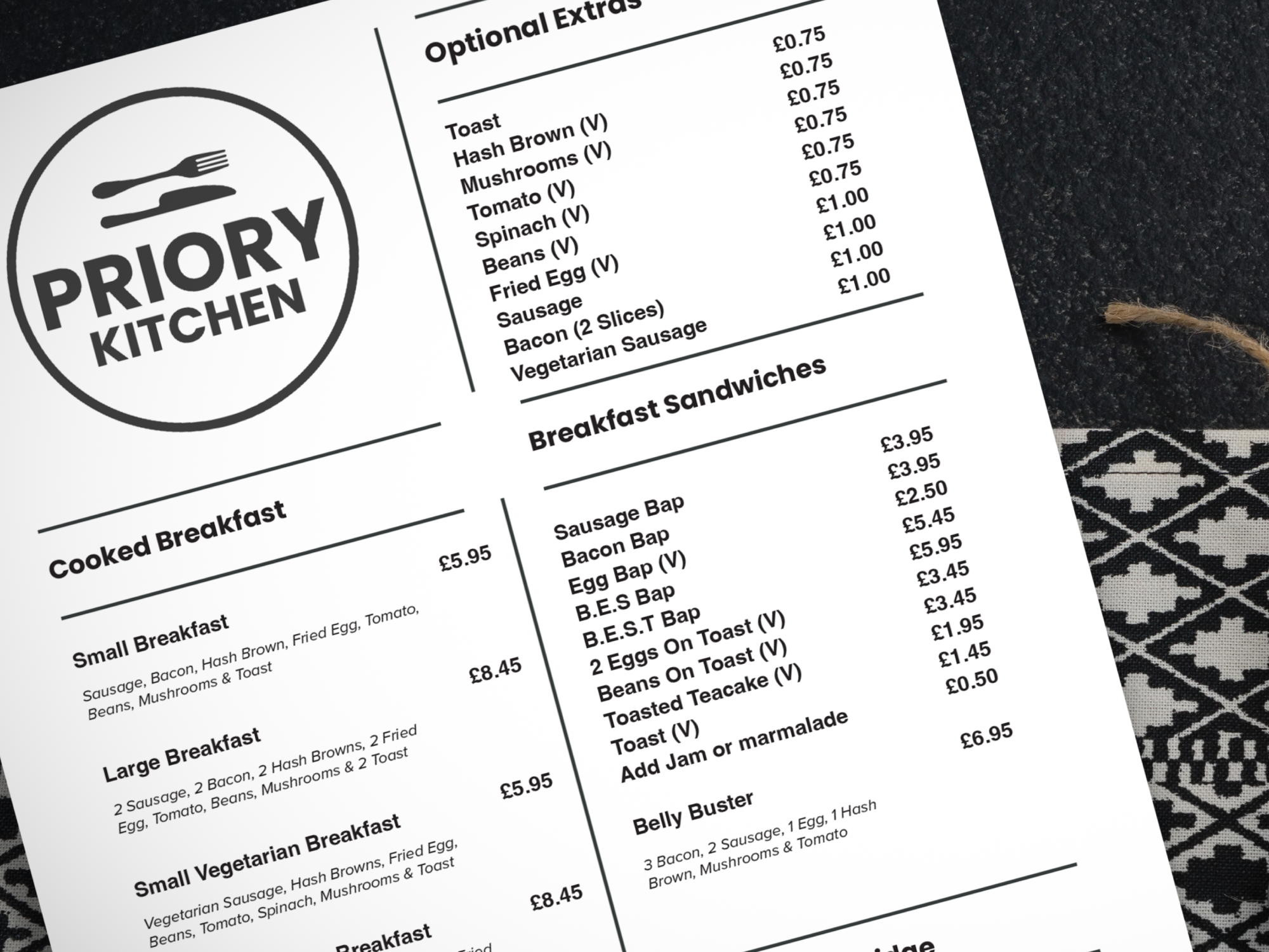
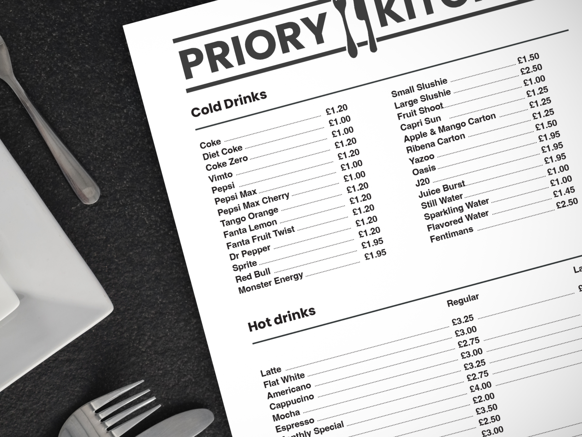
I developed a clean and contemporary logo that became the cornerstone of their branding strategy. This logo was versatile enough to be incorporated seamlessly across all their content, from digital media to printed materials. Additionally, I provided them with well-designed menus that were not only visually appealing but also user-friendly, making it easy for customers to navigate their offerings.
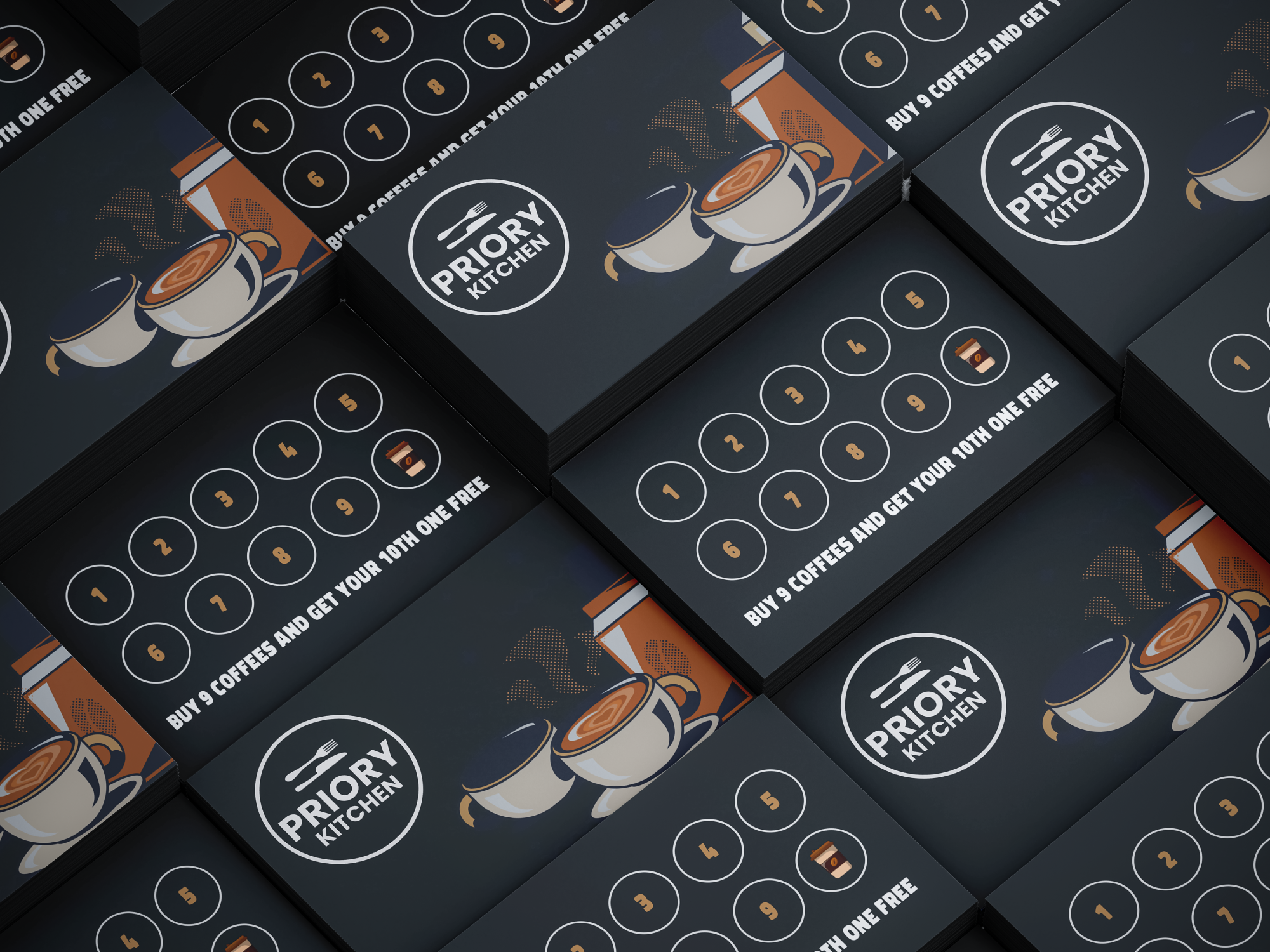
To enhance customer engagement and retention, I also created stylish and practical loyalty cards. These cards were designed to be straightforward and easy to use, encouraging repeat visits and fostering customer loyalty. Overall, the branding solutions I provided for Priory Kitchen were modern, accessible, and effective, ensuring their brand stood out in a competitive market.


The Logo
The client requested a simple and modern logo, providing an example to guide the design process. In response, I focused on creating a clean and straightforward design. I layered the typography to create a unique and cohesive look and incorporated a knife and fork to symbolize the restaurant's dining aspect. This combination ensured the logo was both visually appealing and immediately recognizable as a place to eat.
Loyalty Cards
The concept behind these cards was to introduce a simple yet effective loyalty system that would encourage repeat business. The idea was that for every nine coffees a customer purchases, they would receive their 10th coffee free. This rewards-based approach not only provides an incentive for customers to keep returning but also adds a fun and engaging element to their visits.
By offering something tangible in return for their loyalty, it motivates them to fill out their cards and fosters a stronger connection with the brand, turning occasional visitors into regulars.
Menus
The menus were designed with simplicity in mind, ensuring a consistent style throughout to maintain a cohesive brand identity. By keeping the design uniform across all menus, it reinforces the brand’s image and creates a seamless, recognisable look that ties everything together.


